

The Case Against San Serif Type
 I am not a fan of sans-serif typefaces, which puts me at odds with most web designers today, so I want to make the case for semi-serif and full-serif typefaces before they disappear forever. More specifically, I want to explain why BindleSnitch continues to use Times New Roman.
Serifs are the tiny points at the ends of the lines that make up the letters in a font. Serif typefaces have more pronounced serifs. Semi-serif typefaces have very tiny extensions. Sans-serif typefaces have none.
Once upon a time, the serif typefaces ruled supreme. To this day, most books – except for computer manuals and some scientific works, are published in either Times New Roman, Georgia, or some other member of the New Roman type family.
Times New Roman was originally developed for The Times of London in 1931 to replace an older serif typeface that was paradoxically called, “Modern.”
The New York Times adopted Times New Roman shortly after the Times of London because it enabled the newspaper to get more words on the page by making the letters easier to read and therefore more easily condensed. Here is a sample of Times New Roman from The Times presented next to the previous font, Modern, which was also a serif typeface:

Today, neither The Times of London nor the New York Times uses Times New Roman. The New York Times uses a variant of Times New Roman called Georgia…but neither paper uses a sans-serif typeface, either in their print editions or in their online versions. The Washington Post uses a semi-serif typeface for its headlines and a sans-serif face for its body type.
What’s the big difference between these typefaces. Why does this even matter to the average reader, and how did sans-serif typefaces become some popular if they aren’t that good. Let’s answer the last question first.
How Did Sans Serif Type Faces Become So Popular
Sans-serif typefaces became more popular right around the time that computers were being introduced to the business world.
In the early days of the computer industry, the monochrome monitors used by every computer maker had relatively poor resolutions compared to modern monitors. The resolution was so poor that the early monitors simply could not reproduce the serifs in the serif and semi-serif fonts.
Early computer software were also unable to handle proportional typefaces because early word processors kerned the typefaces by giving each letter exactly the same amount of space. This is called a mono-type face. The serifs could not work in that environment because the edges of the letters would occasionally overlap each other.
There was another problem with serif typefaces. Dot matrix printers could not reproduce them because the dots in a dot matrix printer were all one size and the only way to reproduce a serif would be to have dots of different sizes in the dot matrix.
The simpler solution was simply to use a sans-serif typeface…but this is what happens when you use a sans -serif typeface.
What’s the Big Difference Between Sans Serif and Serif Typefaces?
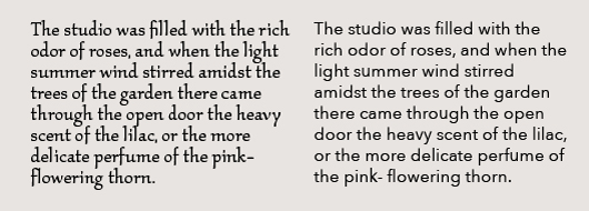
 The first thing you might notice is that the Times New Roman version is more compact than the Calibri version. Ergo, it is possible to get more words on the page in the same font size. This mattered when newspaper s balanced the number of lines of copy in an edition against the number of lines of advertising. In the modern, online world, there are no constraints on how much space an article can be given, so no one cares if a sans-serif face takes up more space than the same number of words in a serif type face.
At this resolution (11 point type) it is difficult to see the difference, so let’s increase the size of the samples. Here are the same sentences in 14 point type:

Now, if your eyesight is good enough, you will begin to see that there is a slight difference between the capital letter “I” and the lower case letter “l.”
You will note that they look almost exactly the same. So, what’s wrong with having a capital “I” and a lower case “l” in the same word.

Let’s make them bigger again:

Which version is more legible to your eyes? Of course the I and the L are a unique care…or are they? Let’s look for some other examples:

Based on juxtapositions, you might well expect the rapidly moving eye to confuse both “I” and “J” as well as “M” and “N,” and “V” and “W.” Also note that is impossible to differentiate between the “O” and the “Q” without the serif on the letter “Q,” so, in fact, all sans-serif typefaces always have at least one serif letter in them. You might also notice that lower case serif and sans-serif letters area almost identical to each other, with the exceptions of the I, L, M, N , V and W.
People with modern eyes – which means anyone under the age of 40 – have been conditioned to ignore the advantages of semi-serif and full serif typefaces, even though modern computer monitors and printers can easily resolve the serifs. They think that Times New Roman is old-fashioned and fuddy-duddy, ignoring the fact that almost all of the printed material they read (if they even read anything in print any more) is printed in some variant of the New Roman typeface.
Now, as to why this should matter to the modern reader, studies have shown that semi-serif typefaces read faster than sans serif typefaces. Semi-serif faces are considered easier on the eyes by ophthalmologists, who use sans-serif typefaces for eye charts, but use serif faces for close up reading tests.
To be fair about this, all serif typefaces are not created equal. Some serif fonts are much harder to read than sans- serif faces. The exceptions that prove the rule are the more ornate and archaic semi-serif and full-serif faces like ITC Kallos, which is widely used for poetry because it looks archaic, as this example demonstrates:
Our reason for preferring serif typefaces, aside from the obvious one (old dogs not learning new tricks), we believe that when people read faster, they read more and our objective is to get more people to read more of our articles. So, here’s a question for BindleSnitch members: should we switch typefaces or stay with Times New Roman. The floor is open for discussion. Use the comments box for your replies.
![]()
06/12/2019 @ 2:02 pm
I prefer sans serif types because of my vision. I use Comic Sans MS for my own projects. Type with serifs adds clutter that my brain has to unclutter. Many low vision individuals have this issue. I realize that others don’t have this problem. But, this is my 2 cents.
06/12/2019 @ 2:22 pm
I just replied to you in the main article.
06/12/2019 @ 2:22 pm
I sorta threw in the towel on this issue. I have vision challenges of my own but Satya more or less insisted that I switch to a san serif type face so it is amusing to me that this article about serif type faces is actually in a san serif face now.
07/02/2019 @ 9:36 am
On both OS’s, I used Times New Roman. I like the look better. I think we should introduce our own Serif typeface in some sort of British style and call it Serif of Nottingham. Or perhaps title this article I Shot the Serif. I think those fonts are just serific.